Wednesday, December 3, 2008

map a photo onto a shape.


Mapping photos onto shapes is a standard for photo-based posters and memory collages. It is also a great method of creating illustrations.

First-
make any shape using the pen tool or anything from the shape library. In the pen or shape options make sure that you have the shape button selected. If you have been using paths it will be set to paths from last time. It doesn't matter what color the shape is.

Second-
Place a photo in a new layer above the shape. If you started with a photo, you can double click it to make it a layer, then drag it to the top of the stack in the layers palette.

Third-
Hold the OPTION KEY. Now scroll your mouse over the DIVIDING LINE between the two layers. the cursor changes to a symbol of two interlocking circles. Click the dividing line between the two layers. The photo is now linked to the shape and uses it as a vector mask.

Manipulation-
The image and mask can be manipulated separately. Use the move tool to manipulate the image. Use the path selection tool and direct selection tool to manipulate the mask. Use the pen tool to add, delete and alter points.

Signature style-
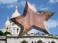
A special signature style of photoshop is the look of a transparent shape with an image map floating over another image. This is referred to as the "glass tile" look, and I'm sure you have seen it everywhere. Reduce the opacity of the shape layer and place another image behind it for the glass tile look.

Vectors and FX
Remember the FX palette? The FX palette works with vector shapes (although we've only used it for text, another kind of vector shape) Use the FX palette to apply a bevel to the final product. click on the fx button in the layer palette to apply the bevel. The final effect is really pleasing, and used everywhere for photo-illustration. Going for total commercial cheese? add a lens flare (filters-render-lens flare) to a star shape photo map for kitschy glamour.

Monday, December 1, 2008

heidi fixed

Sunday, November 30, 2008

statue details


fix heidi klum/ then make her into an alien

use the healing brush to repair all of the wrinkles and other problems with heidi

use the red eye tool to fix heidi's red eye.

use the blur tool to smooth out the rest of her skin


create an adjustment layer (levels) and adjust rgb channels separately to change the color of her skin and hair.

download the three statue pieces.

cut them from their background by using magic wand and selection tools. copy and paste them onto heidi's face and arrange them with move/transform. make the pieces fit the face.

clean up the edges of the pieces with the eraser tool.

duplicate the layers of each piece. (drag layer image into new layer button) set each duplicate to screen.

Derive selection from each piece. make a new layer at the top for a color silhouette.

Choose paintbucket and sample heidi's skin color using option key.

Fill selection set with paint (skin color)

Switch blending mode of silhouette layer to color.

Select all three layers by holding shift. Hit apple G for group.

Make sure your move tool is set to auto select group.

Apply a mask to the group.

Use the black to transparent gradient to fade transitions between the face and the statue pieces.

repeat with all of the statue pieces.

blur/sharpen/burn/dodge/smudge

alter the picture of the Sacre Cour in the following ways:

Dodge the wall in front of the sacre cour.

Burn the church itself.

Blur the wall in front of the sacre cour to create a depth of field effect

Sharpen the church itself to emphasize its detail

Smudge the sky and clouds into new forms.

Tuesday, November 25, 2008

we ain't afraid of no ghost!

heidi klum looks like crap!!!!

use the healing brush and color adjustments to fix grama!


tour with dark sky- experiment with adjustments panel paint color layer with color replace tool

alter figure and background selectively with levels and curves

sacre cour- darken the sky with an adjustment layer and paths.

images for alteration

three project ideas for the last week

1.

http://www.design21sdn.com/competitions/17/rules

work on this poster contest. $3000 dollars for 8x11 poster. submit by jpeg upload.


2.
Expand your illustration project:
build some photos into the illustration you are making, or make another page.

3.
A photo-based poster. Any photo based poster, any size.

4.
A photo-based comic book. Use photos to make a comic diary.
free trial of comic software for your mac or pc at home:

http://plasq.com/downloads/

5.
Simply edit a photo set. save a ton of photos on your flash drive and work on them as you will in class.

It is important that you have something to do and are not empty handed in the last week!

Monday, November 24, 2008

CLASS SCHEDULE AND FINAL ASSIGNMENTS

Your current assignment, the color/illustration project, is due on the last session of class, Monday December 8. Please remember that this assignment should include text of some kind, which brings us in to the narrative you are creating. Along with this assignment, please print out the file of my drawings that you have been working on, also due december 8.

Normally I also assign a large scale photo-editing project, but we only have 2 weeks of work meetings left. So, to fit our time constraints and to ensure that we get through all the photo editing demos, your final project will be something you design yourself. There are two guidelines:

1. Your final should be photo-based. The photos should be photos you've taken yourself.

2. It should be separate from the illustration project.


You can simply edit and adjust any set of photos you have taken, or you might choose to do a photo-collage or poster. A photo-based comic book is also a really fun project. size and output are up to you. please think carefully about your project. Bring a written project proposal and a set of your own photos to work on next class. Remember, it should be something you can do in a few hours, there will be a lot of demos next week.

final cloud with gradient color layer and light shapes.


an extremely cheesy looking image, but a good example of simple photo editing (with non-photographic goals)

photo brushes and color layers

two quick elements in painting that will bridge us into photo editing:
PHOTO BRUSHES AND COLOR LAYERS

Photo Brushes:
Just use edit> define brush preset
on a photographic source!
take any detail of a photograph and make it black and white. (image>mode>grayscale)

Then use (image>image size) to reduce it to about 2 inches.

remember black defines the brush and white does not paint, so you may need to invert it (apple I)

adjust levels to set transparency (apple L) black is solid and gray is transparent.

when you are ready, use (edit> define brush preset) to make a new brush from a photographic source.

Make a cloud brush, change its parameters so it scatters, and paint into the other cloud image. While painting, use option to sample color from the image.

COLOR LAYERS
color layers are important to photo editing. They define a color for any given value system, and can be masked out to blend the original color. The main application is for photocollage, when you want to mix parts of two different photos.

Make a new layer in the cloud composition. Set its mixing style to (color) fill it with any color using the paintbucket. Your composition is preserved but it's color has changed. Try making color layers with the gradient tool! try masking a color layer or using an active selection set before you fill. Color layers work well as a final step for integrating photobrush work. everything hangs together a little better and seems more believable. Transparent shapes (such as rays of light) seem more believable when unified with the rest of the picture behind a color layer.

image resources for photo brush and color layer


Friday, November 7, 2008

drips

Wednesday, October 29, 2008

intro to project.

Illustration project.
the concept of this project is that you are making a page or several pages from an illustrated children's book. The drawings should be mainly your own, although you can include elements of found copyright free line art. For example, you could include some backgrounds from the myth images to support your drawings. An example of a poor grade would be: completely excluding your own drawings, or simply coloring copyrighted material or another artist's work. remember there is no such thing as an authorless image. have the courage to focus on your own work, even if you are just using doodles.


Be accountable for all painting techniques taught in workshop sections. This means not missing class or being late. Each class for the next few weeks will begin with a painting technique demo. It is your responsibility to practice up on each technique and come on time to learn them. I cannot be responsible for your tardiness in my curriculum and I will not make the other students sit through the same demo twice. I will be looking for all of the painting techniques in the project grade I assign.

Scan your line drawings. Use File> Import and browse the name of the scanner from photoshop. Don't use independent scanning software. Make sure the length x width x depth numbers make sense and just struggle with the program until you figure out how to change them. an example of not making sense: 40 inches by 60 inches by 20 dpi. take turns on the scanners. you must always hit preview before you hit scan.


Include scanned, hand-written text. Imagine that the story of your children's book will be set typographically in handwriting. you may write your own story or illustrate an existing story that you like.


Layout:
this will be the same as the first project, oriented horizontally. 20 w x 15 h x 200 dpi. If you are a wizard at these techniques I expect you to produce several pages from your story at this size. Big size means a more difficult paste up, but it also means a more compelling portfolio, and the ability to work in full production with just a laser printer. I appreciate your hard work in paste up, and the expense of presentation boards, but that labor and expense are a pretty cheap purchase of a nice looking portfolio. Believe me, when someone says they are a digital designer or artist and they hand you a stack of 8x11 printouts as their portfolio, it is such a joke, and generally those go right in the trash. Output is everything, especially if you want to be in the same world as painting and illustration.

Tuesday, October 28, 2008

van gogh


Monday, October 27, 2008

links

video workshops
http://www.adobe.com/designcenter/video_workshop/


photoshop online
https://www.photoshop.com/express


art history images
www.wga.hu

alligator
http://visualelements.blogspot.com/

If you are all done with the myth project and printing it...

Others need to catch up a little bit today.. So we will aspire to have an intense workday on this project. You may be among those that feel like you can't add anymore mask effects or details and that your project is totally done. That is ok too.

In that case you should:

1 print and trim and glue your project.


2 Scan your line drawings. Use File> Import and browse the name of the scanner from photoshop. Don't use independent scanning software. Make sure the length x width x depth numbers make sense and just struggle with the program until you figure out how to change them. an example of not making sense: 40 inches by 60 inches by 20 dpi. take turns on the scanner.

3 Help out someone next to you that is still struggling with masking and mask effects. Lots of people need help with these concepts, and I would ask you to pass your understanding on to someone else, because the class is large, I often unfortunately miss people in one to one work time.

4. Start on another black and white study. Start a new file size 10 x 16 x 200 in grayscale and use exactly the same methods we've been working with in your study. Find new imagery, expand on your original theme. Try to invent mask effects or work all with masks and filters. Push your mastery over the ideas.

5. Start a color study. Start a new file size 10 x 16 x 200 RGB. copy some of your figures and backgrounds into this file. Set line art to multiply blending mode. Recover selections from your figures and make masks. Paint in a layer below the figure and copy the mask onto the color layer. This is similar to what we will all work on together on Wednesday.

printing procedure

Monday, October 13, 2008

finished alligators